Charts have always been popular as a powerful tool for Excel. We often compare some data. In order to facilitate more intuitive browsing, I personally think it would be better to make a data comparison graph. So how to do it? Here’s how to do a data comparison diagram in an Excel spreadsheet.
Steps to make a data comparison graph in Excel 2016 spreadsheet
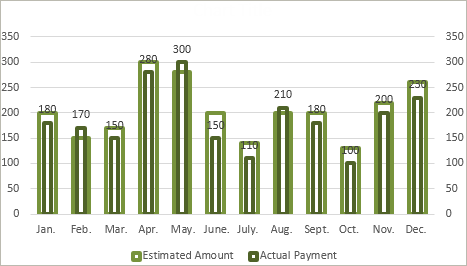
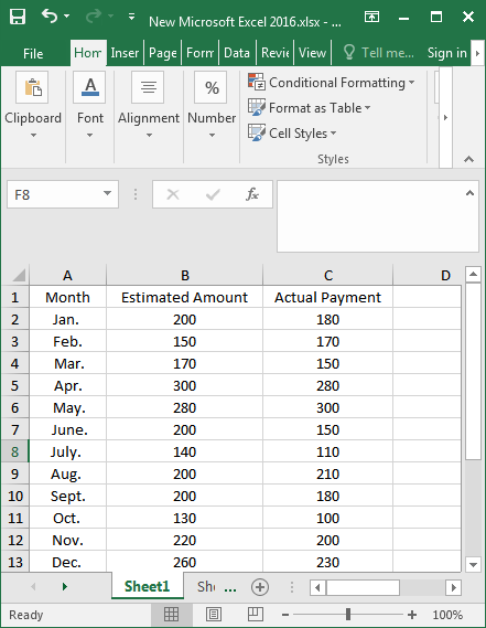
Step 1: First, prepare the test data. We use the estimated amount and actual payment from January to December as the test data.
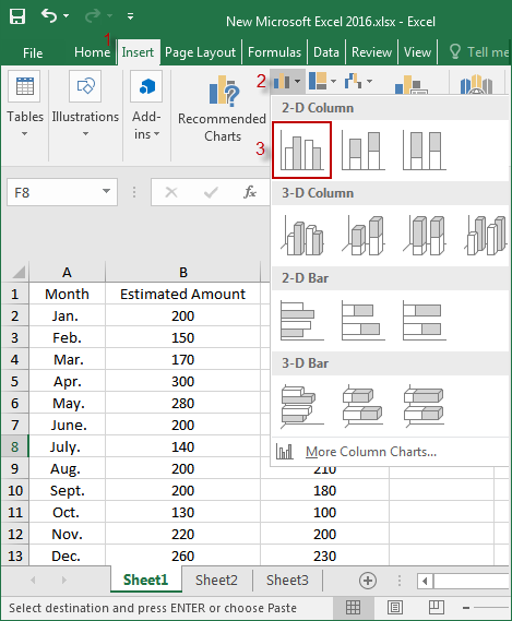
Step 2: In the Excel table, select the Insert, and then select the histogram, which I think is a commonly used figure. The difference between the two sets of data can be seen at a glance.
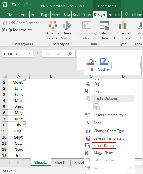
Step 3: Right-click on the blank histogram and click Select Data.
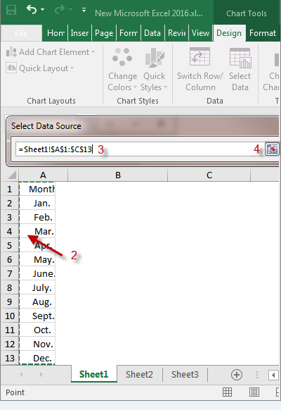
Step 4: When the Select Data Source window appears, click the red arrow behind the Chart data range.
![]()
Step 5: Next, select our data table, then the data source ( Sheet1!$A$1:$C$13 ) is displayed in the box.
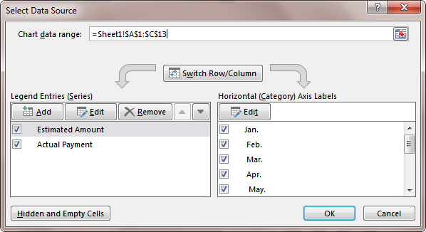
Step 6: You’ll see this page.
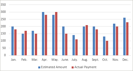
Step 7: This creates an initial histogram.
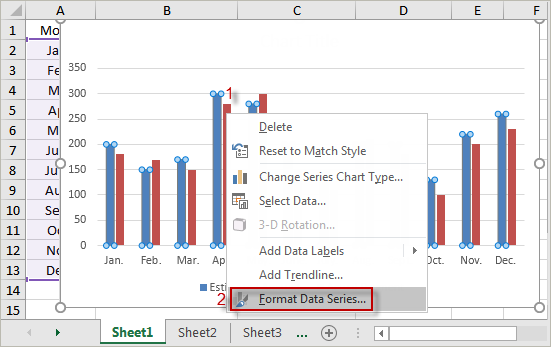
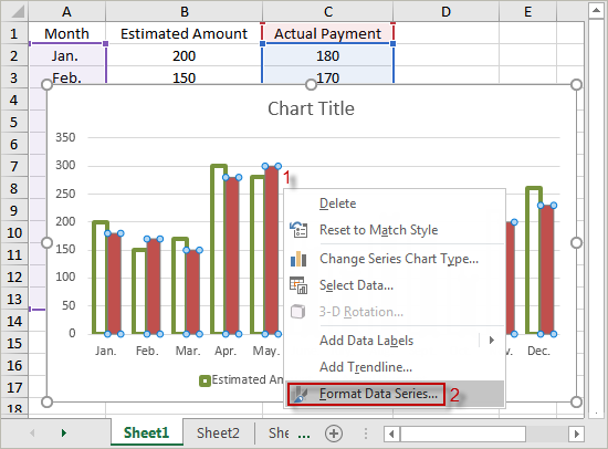
Step 8: We need to modify this histogram. First, we select the estimated amount (in blue), then right-click it and select Format Data Series.
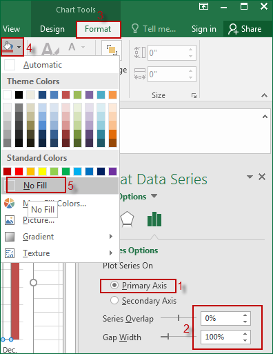
Step 9: In the Series Options, select the Primary Axis and set the Gap Width to 100%. Then select the Format and set the shape fill into No Fill.
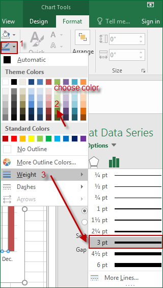
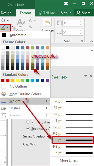
Step 10: Set the color and set the shape outline to 3 pounds.
Step 11: Now, the estimated amount is set up, and start to design the actual payment. Select the actual payment, right-click it to select Format Data Series.
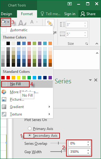
Step 12: So here we’re going to set it to the Secondary Axis, and set the Gap Width to 350%. Then set the shape to fill with no padding.
Step 13: Choose the color you want and set the shape outline to 3 pounds.
Step 14: Finally, let’s improve it. Select the actual payment, right-click it to choose Add Data Labels to display the actual payment amount.
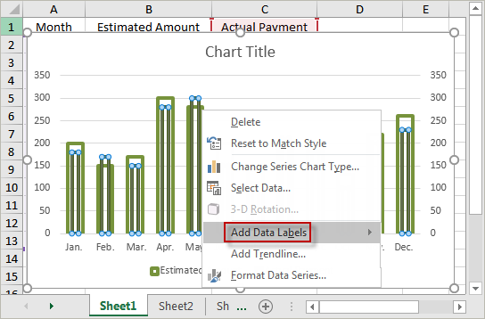
Step 15: Now that we’re done, it’s clear that there’s a gap between the two sets of data.

